Trader Joe's Map Kiosk


Year
2026
Client
Trader Joe's
Project Type
UX/UI Design (Capstone)
TEST THE PROTOTYPE
The Problem
Trader Joe’s is known for its high-quality, affordable, and exclusive products, but its small store layouts and high foot traffic make shopping feel cramped and chaotic, especially during peak hours. Without self-checkout, lines get long, and navigating the store can be frustrating for customers and employees alike.
On top of that, customers often feel blindsided when popular items disappear without warning. While the unique product selection keeps people coming back, improving store flow, checkout efficiency, and communication around limited-edition items could make the experience even better.

Some common themes among the responses included:
1
The store’s layout is not only crammed but also “disorienting”
2
Crowding gets excessive, especially during the weekend
3
Employees often switch between tasks due to the store’s busyness
4
Availability of certain items (especially seasonal and limited) is not clear enough
User
Journey Map
Based on the problems identified in the thematic analysis, I created a user persona and a user journey map to identify some painpoints during a shopping trip to Trader Joe’s.

The following painpoints were identified:
1
Users struggle with asking employees for directions because they’re all busy doing other tasks
2
This, added with the confusing layout, causes them to wander aimlessly around the store to find their items
3
Ultimately, this will lead to more foot traffic in the store
4
This greatly slows down the shopping experience, especially for those in a rush
The Opportunity
This presents an opportunity to implement user-experience techniques and digital tools to make the shopping experience at Trader Joe’s much more convenient, concise, and enjoyable.
Sketches
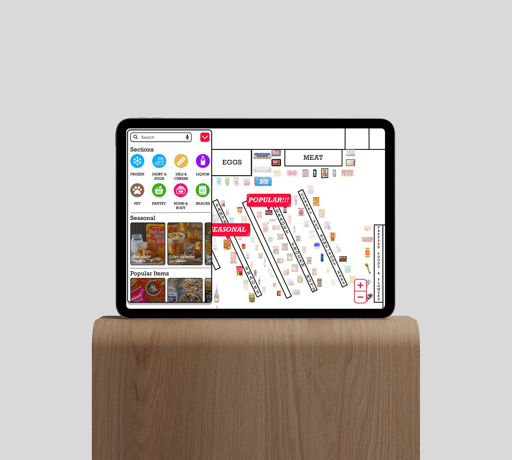
While brainstorming features for the map kiosk, I was ensuring that the map was clear and easy to use.
This is so users can skim through it and quickly find the product they are looking for. This ensures people complete their tasks quickly, thus preventing them from agglomerating around the kiosk.

Style Guide
While I wanted the visual language of the map kiosk to be distinct, it was still important for it to somewhat match Trader Joe’s nautical visual language for cohesion, ensuring a minimalist, product-first design.
The secondary colors were chosen based off of the colors people associate with the most with a particular section (blue for cold items, green for produce and foodstuff, etc.).

Feature Overview


Usability Testing
& Feedback
To pinpoint any room for improvement, I recruited four participants to test the map kiosk to conduct a usability test for the it.
The navigate feature was immediately intuitive — users found and followed routes without any prompting.
Special item callouts (POPULAR, SEASONAL, LIMITED) were noticed and appreciated by all four testers.
The split-panel layout (catalogue + map) was understood quickly and felt natural to browse.
Visual design aligned well with Trader Joe's brand-testers recognized it as belonging to Trader Joe's.
Weaknesses
Some users relied on trial and error when searching —category labels didn't always match their mental model.
The map zoom level on first load was confusing — users weren't sure how much they could interact with it.
A few users missed the collapsible widget toggle — the affordance wasn't obvious enough.
Some of the users struggled reading the text due to its size
Reflection
This project demonstrated the importance of validating design decisions through user interaction. Observing users interact with the kiosk revealed gaps between the intended experience and actual behavior.
These insights highlighted the importance of iterative testing, simplified wayfinding, and designing public interfaces that prioritize speed and clarity.
Some users relied on trial and error when searching for items. In the next version, I would refine the category structure and labeling to better match how customers typically think about grocery items.
I would also add more indicators, particularly in the home screen, so users will know they are able to zoom in the map.
Adding search suggestions or commonly searched products could also help users find items faster.
Final Deliverable
Latest Project