Library Commons Mobile App


Year
2026
Client
J. Edgar and Louise S. Monroe Library
Project Type
UX/UI Design (Capstone)
TEST THE PROTOTYPE
The Problem
The Monroe Library is a vital resource for the Loyola University New Orleans community, but it is difficult for Loyola students to see availability of equipment and study rooms without having to go physically to the library, without guarantee that what they seek is available.
The present friction and lack of convenience that students experience frequently to access library resources hinders the students’ experience and trust in it.
Initial Research
To identify painpoints library-goers face, I visited the Monroe Library and made a user journey map based off of it.


Four core problems were identified:
1
Outdated, inconsistent and insufficient signage makes navigation difficult
2
Users cannot easily locate key destinations such as study rooms, service desks, or offices
3
Lack of information about how to check out equipment and lack of modern, centralized system (such as online booking) creates confusion
4
Visitors are not immediately oriented to what the library offers or where to go first
The Opportunity
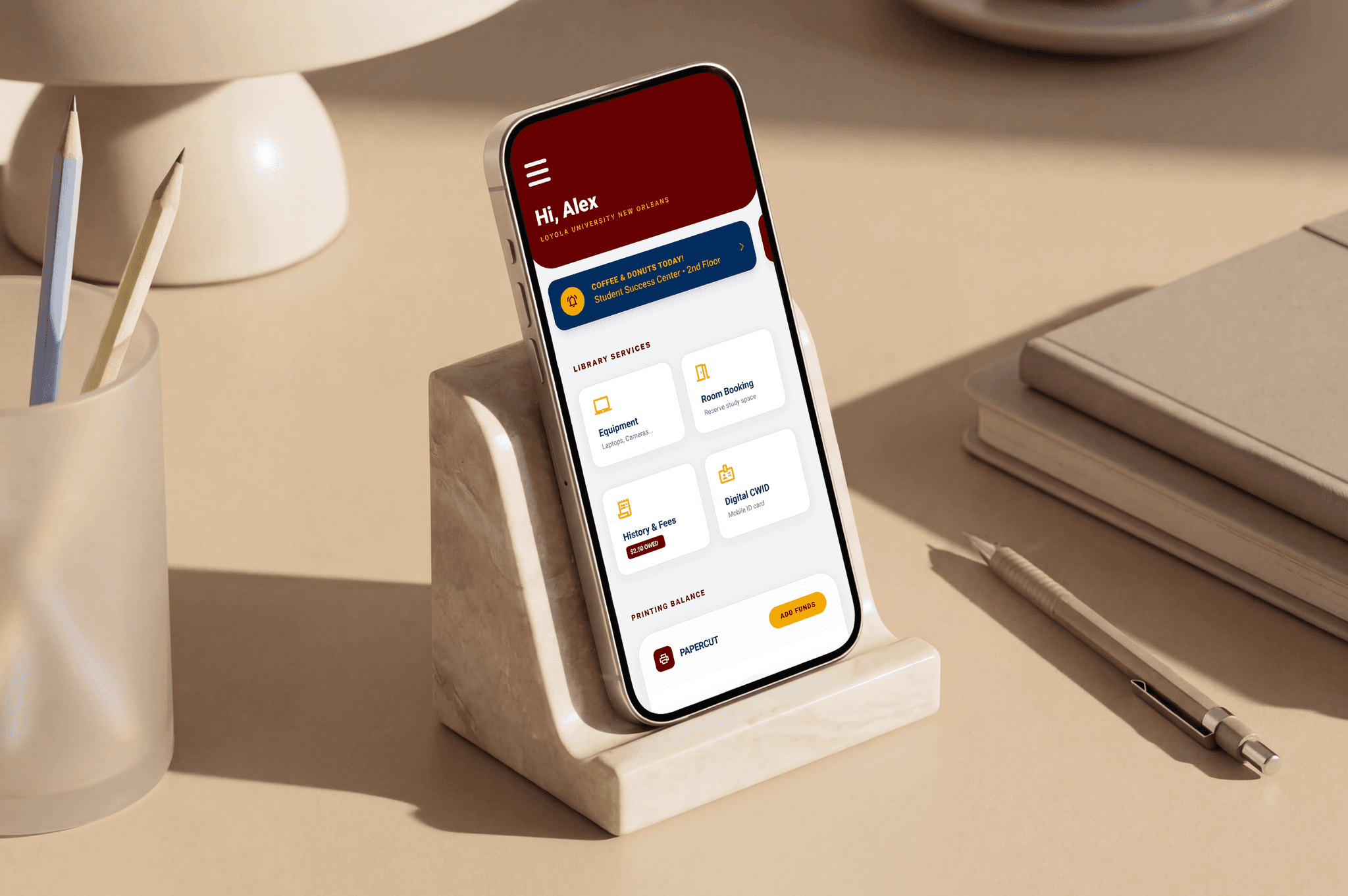
This presents the opportunity to design a mobile app to centralize all rentable items and study rooms in the library to create a seamless checkout experience for students.
Visual Research
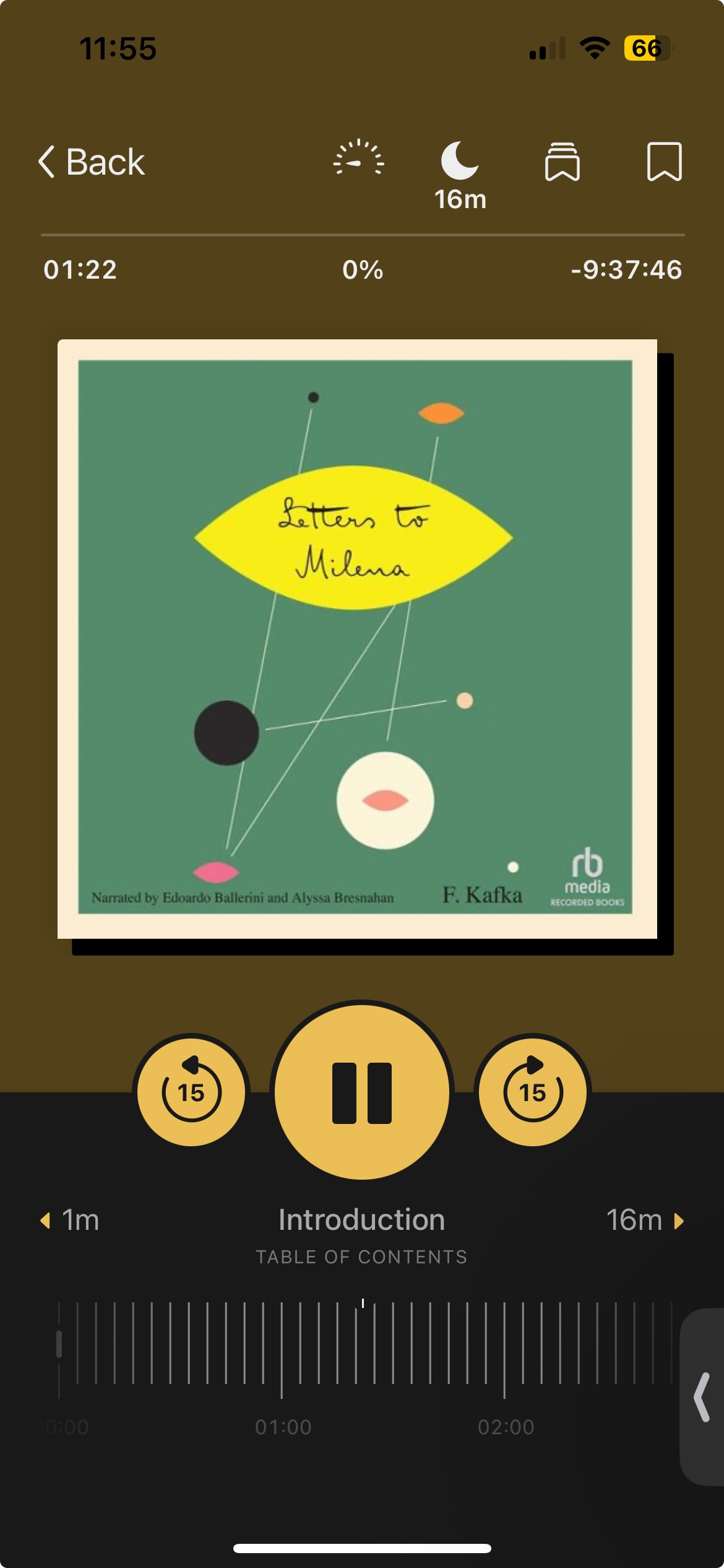
To understand what features library-goers needs for a library app, I conducted a competitive analysis, comparing two library apps—the New Orleans Public Library app and Libby.


New Orleans Public Library App


Libby
The library apps prioritized four things:
1
Prioritization of self-service convenience
2
A centralized library ecosystem
3
Transparency of availability
4
Ability to plan ahead of time
Low-Fidelity Prototype
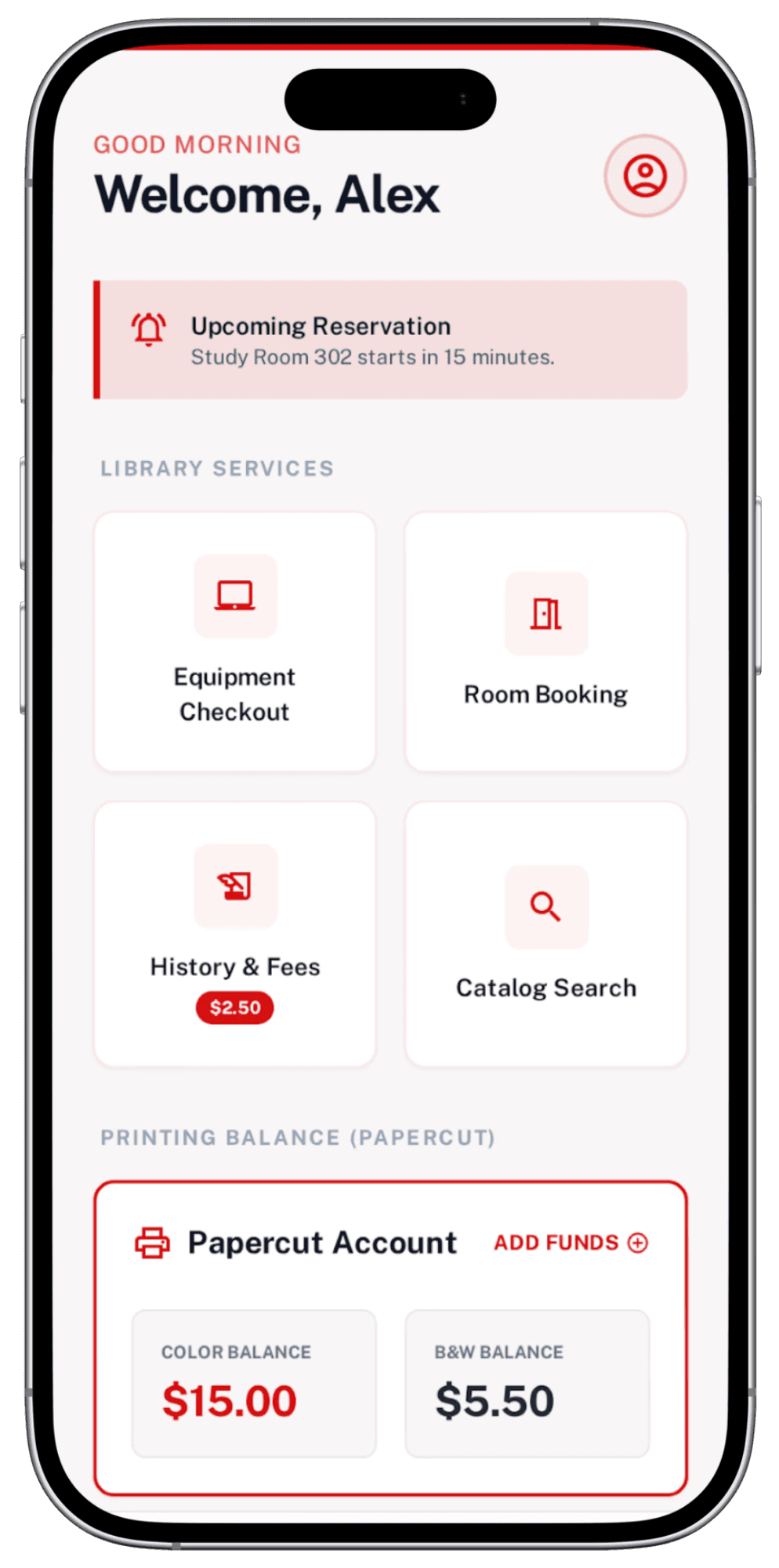
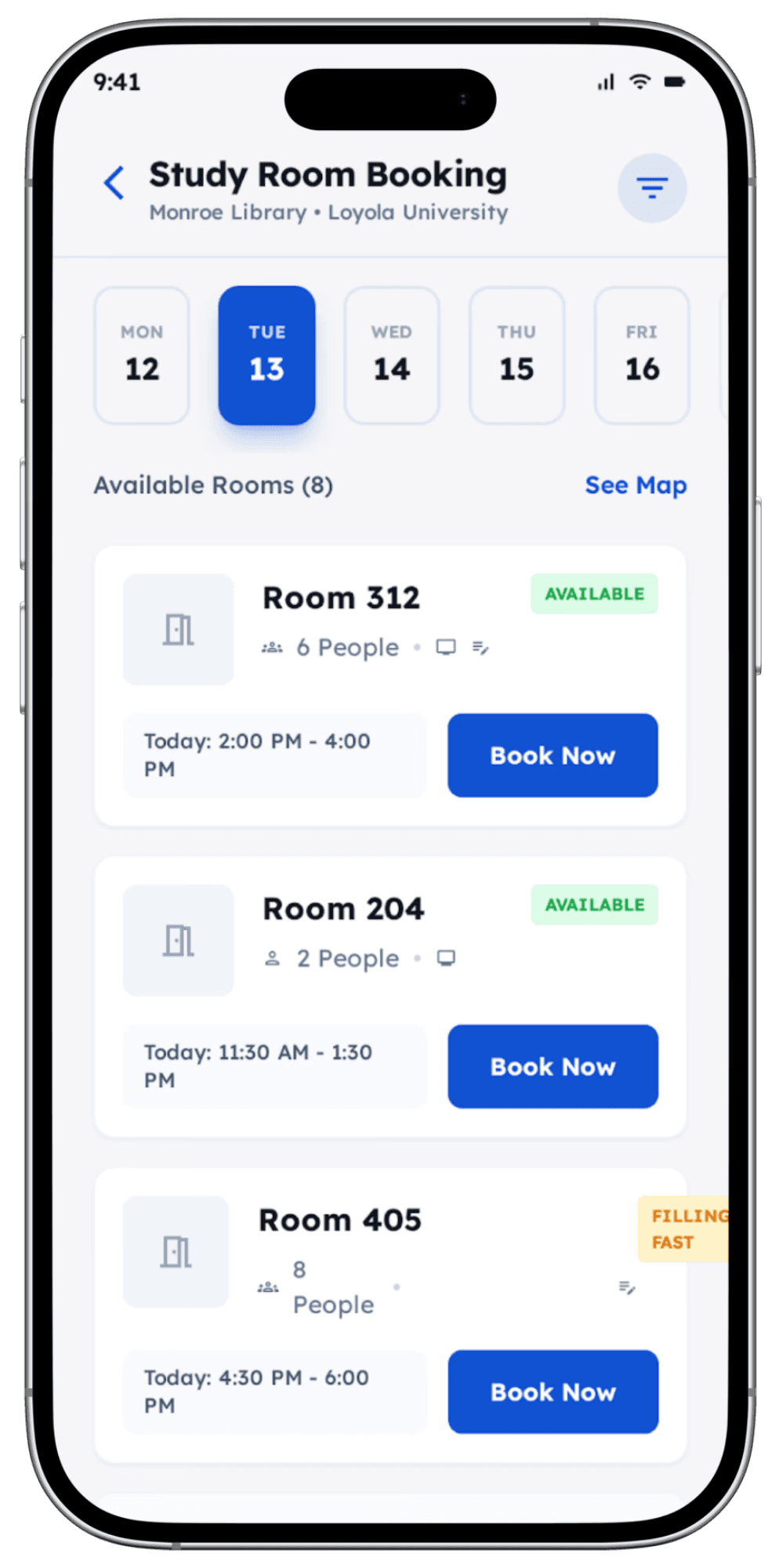
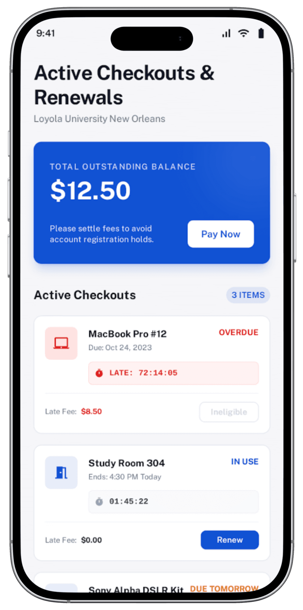
To quickly get a rough sense of the app’s layout and composition (and with the faculty’s consent), I generated some of the key screens with Stitch—a generative AI developed by Google Labs.


Feature Overview


High-Fidelity Prototype
Reflection
Through this project, I learned the importance of progressive modularity and reduction of cognitive load.
Initially, I tried to include as many features as possible on top of the ones already available. However, I realized that it would overcomplicate the app and take away from the five main functions.
Many of the people that tested the prototype have lauded its simplicity and its convenience. If given more time, I would have done more extensive user testing, added more items into the equipment catalogue, and improve the user experience language.
Overall, this project challenged my ability to take complex information architectures and translate them into user-centric mobile solutions.
Latest Project