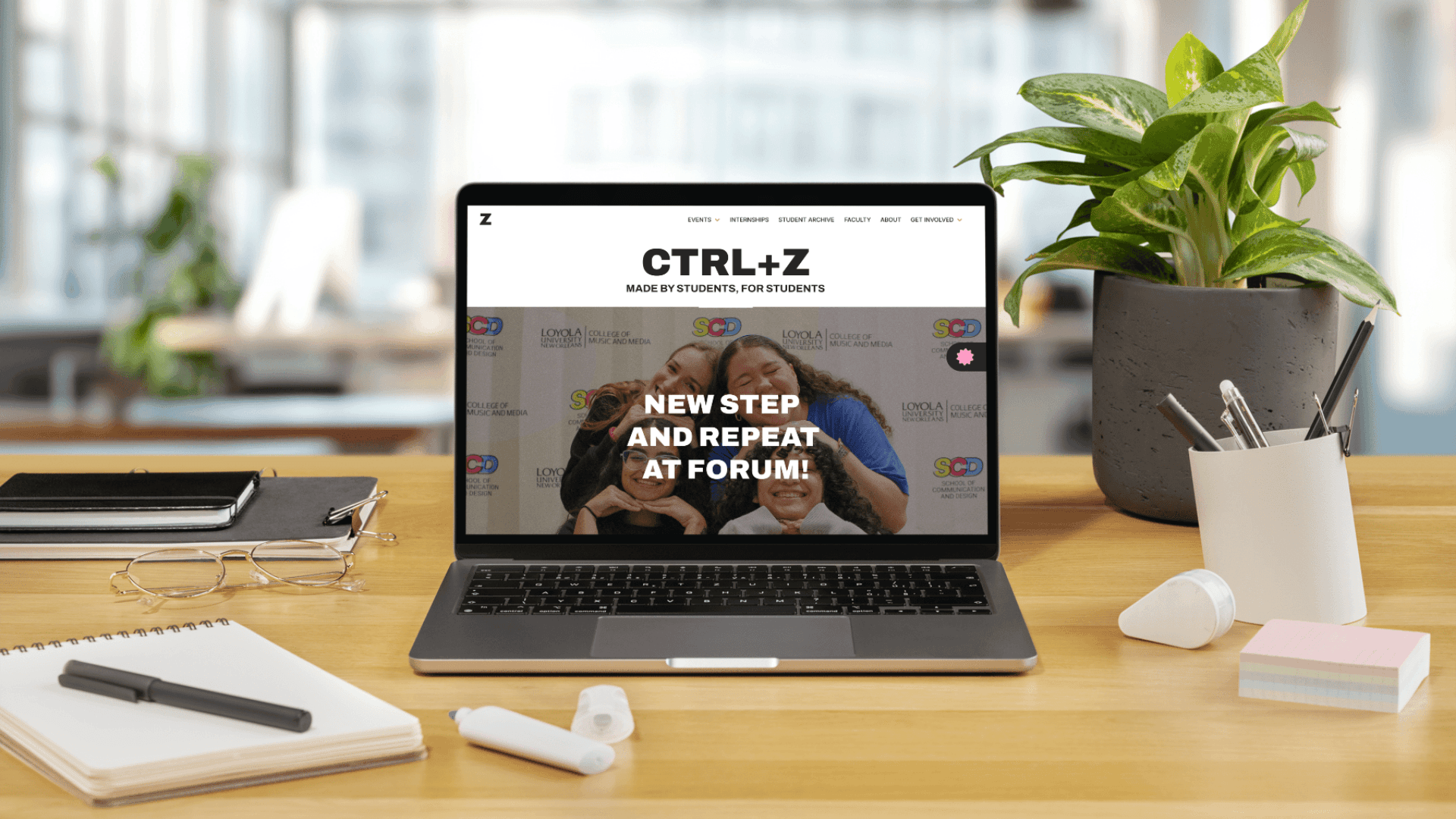
Great Ideas
Digital Gallery Screens


Year
2025
Client
Dr. Benjamin Benus
Project Type
UX/UI Design
TEST THE PROTOTYPE
Context
Great Ideas of Humanity is an ongoing exhibit from the Art Institute of Chicago.
It reimagines the iconic 1950s "Great Ideas of Western Man" advertising campaign by the Container Corporation of America, translating timeless quotes and philosophies into striking visual statements by modern designers via posters.
The Problem
The Great Ideas of Humanity exhibit was visiting Loyola New Orleans in Fall 2025 for a limited time.
However, traditional printing labels do not encourage further interest in the designer or the quote’s author. Not to mention, the illegibility of some of the quotes in the posters and overcrowding, compromising accessibility and the overall exhibit experience.
The Opportunity
This presents the opportunity to curate the massive amount of works (along with their respective information) and compile them into one digital, accessible resource.
Design Process
To quickly generate multiple concepts, my classmates and I developed individual iterations—exploring different ideas, features, and overall visual language and structure of the experience—and refined them in three rounds.
We wanted a natural progression and encourage users to learn more about the posters without feeling forced to.
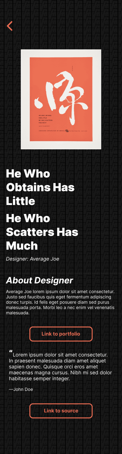
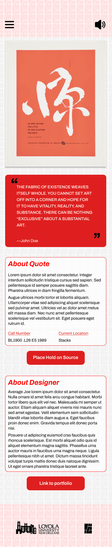
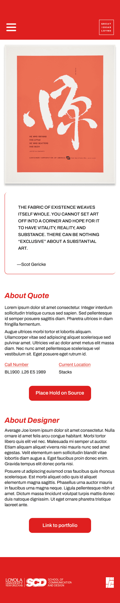
The following screens are my individual iterations:






User Testing
& Feedback
We hosted a usability testing workshop, where we asked our fellow senior graphic design peers to test all of our prototypes. To narrow down to the best three design, we asked them to vote on which screens they gravitated to the most.


New Orleans Public Library App
Some of their overall feedback included:
1
Sticking to left-aligned text for consistency and professional look
2
Increasing text-size to make it more legible
Client Meeting
After the workshop, our class presented the three screens to our client—Dr. Benjamin Benus, Professor of Art and Design History. Overall, the feedback he mentioned included:
1
Further simplifying the layout by steering clear from visual clutter
2
Include arrows to quickly switch between posters in the poster info page without needing to go back to the home screen
3
A “Borrow the Book” button linking to a library database with clear UX language, while remaining visually consistent with the rest of the experience
Pivot
After the careful comments and review, we decided to standardize one final screen o create a template for ALL the posters, and focus on simplifying the design with emphasis on making the quotes more prominent and maintaining consistency with the Great Ideas brand within the design.
To expedite the process, I suggested my classmates implement component variables on Figma within the template, so we could all quickly and easily switch out information in the software.
Feature Overview


Final Product
Reflection
Overall, the Great Ideas Screens effectively improved legibility, navigation and engagement with the exhibit. This project reinforced the importance of designing for real-world contexts, where users are dividing attention between physical and digital experiences.
t also strengthened my ability to iterate based on feedback and think in scalable systems. By introducing component variables in Figma, I helped streamline our workflow and maintain consistency across a large set of screens.
Moving forward, I would focus on enhancing interaction clarity, incorporating subtle onboarding or microinteractions, and testing with a broader audience. All in all, this project deepened my understanding of how thoughtful UX design can extend physical exhibits into more accessible and engaging digital experiences.
Users were able to easily read and understand quotes that were previously inaccessible on the posters, and the structured flow from quote to supporting information felt intuitive
The addition of horizontal navigation between posters helped maintain immersion by reducing the need to return to a home screen.
What Did Not Work
Some users hesitated when engaging with secondary actions, indicating a need for stronger visual cues and clearer affordances.
While the hierarchy emphasized the quote successfully, deeper content such as designer information was sometimes overlooked, suggesting an opportunity to better balance minimalism with discoverability.
Latest Project